As cities modernize by moving utility infrastructure underground into utilidor systems, a critical challenge arises. The invisibility of these systems erodes public awareness, trust, and connection to civic maintenance.
Through generative research with New York City residents, we identified a strong desire for:
- Transparent, real-time communication about underground work
- Recognition of the workers involved
- Accessible visualization of complex infrastructure
- Actionable information for daily decision-making
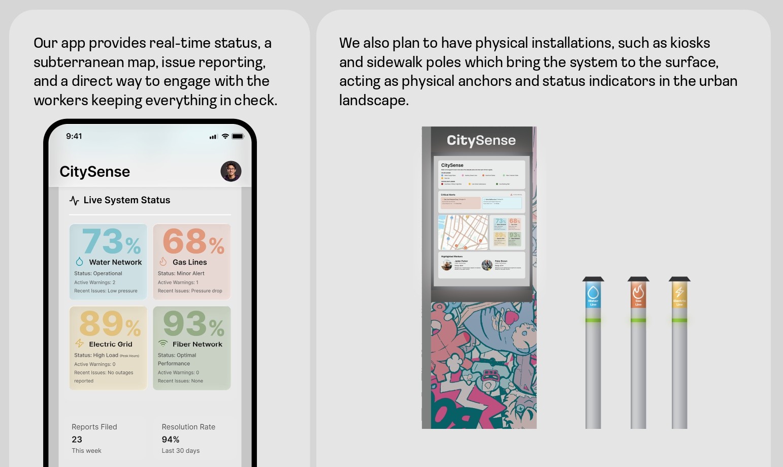
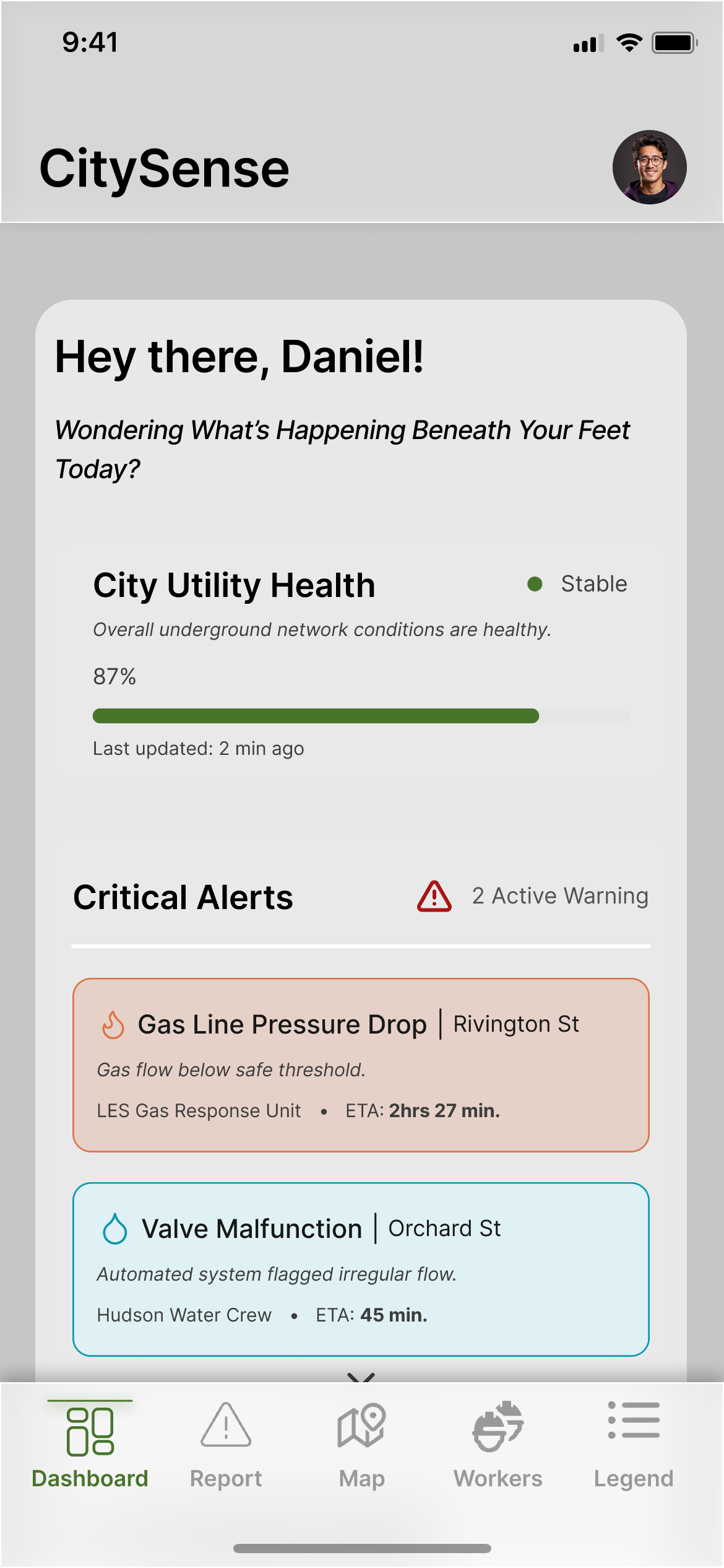
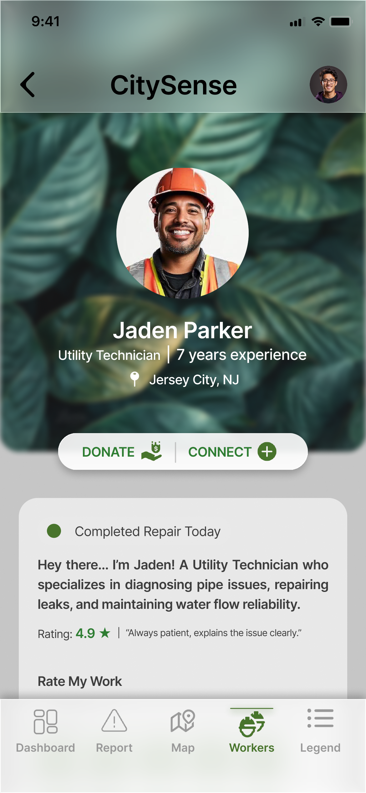
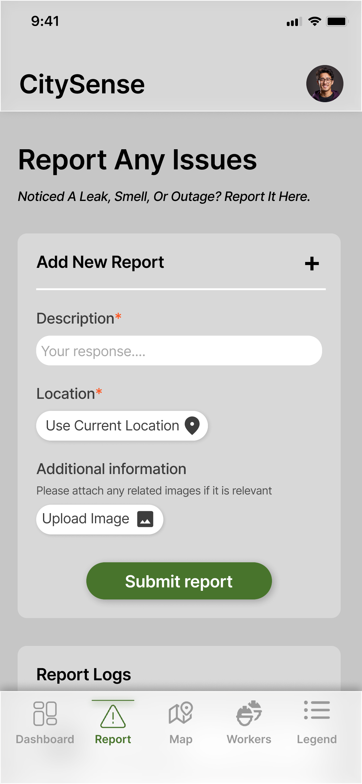
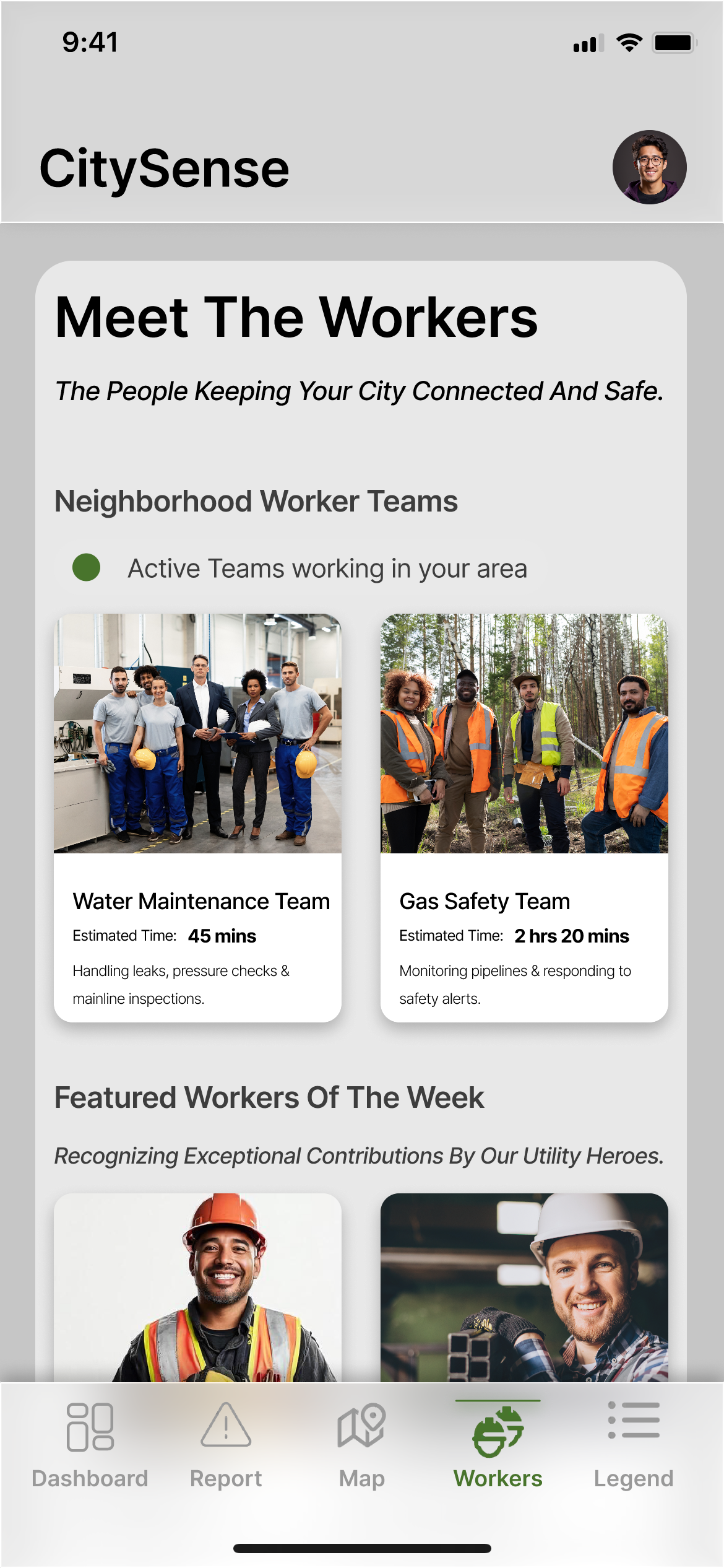
In response, we designed and developed CitySense, a civic transparency platform comprising a mobile app and physical street installations. CitySense provides real-time visibility into utility health, an interactive underground map, issue reporting, and worker profiles.
- Key contributions of this research:
- A novel civic transparency platform bridging the visibility gap in smart city infrastructure
- Empirical findings from a 10-day longitudinal field study on user engagement with transparency tools
- Actionable design implications for fostering public trust through human-centered civic technology